|
|
| |
 |
|
| |
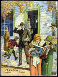
 The
catalogue, a new way of consuming, had become a part of daily life. Eaton's
(Winnipeg) Fall/Winter Catalogue, 1928-29, cover. The
catalogue, a new way of consuming, had become a part of daily life. Eaton's
(Winnipeg) Fall/Winter Catalogue, 1928-29, cover.
|
|
| |
|
|
|
Catalogues and Consumer Loyalty
by Emmanuel
Béland
Catalogue designers employ various promotional
advertising
strategies that allow consumers to identify with accessible models. Their
objective
is quite simple, that is, to achieve customer loyalty; reaching the
customer
is not enough. Through the use of commercial imagery that follows specific
patterns
and procedures, catalogues stimulate interaction between consumers and
companies.
|
Introduction
Truly a social phenomenon, catalogue shopping was a new method of
consuming
that focused entirely on the customer. In a capitalist context
characterized
by competition, the major players — Eaton's, Simpson's, Woodward's,
Dupuis
Frères, etc. — fought fiercely to corner the market. Whether
or
not they admitted it, their goal was to attract new buyers and, more
importantly,
to keep them as customers. As a result, they had to do everything possible
to
secure customer loyalty, which is why catalogues were necessary. In
addition
to promoting the company and its products, catalogues were a more direct
link
between the issuer (the company) and the receiver (the customer).
| |
 |
|
This Simpson's slogan says
it all; this was the philosophy and purpose of every catalogue. Simpson's
Fall/Winter Catalogue, 1934-1935, cover.
|
 |
|
This interaction between the consumer and the company was achieved
through
representation and imagery. The large firms hired catalogue designers
whose mandate
was to reach the target market and secure its loyalty through promotional
advertising.
In other words, they had to get buyers to identify with accessible models,
that
is, models that reflected their reality and daily lives.
| |
 |
|
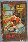
The women in this image are
portrayed as customers (they are flipping through a catalogue) and models
(their photograph is in the catalogue). The strategy is clear: The model
was both accessible and credible because she was also a consumer. Simpson's
Fall/Winter Catalogue, 1923, cover.
|
 |
|
|
From Commercial Imagery to Propaganda
The principle is quite simple: Images play a determining role in every
advertisement.
They transmit ideas, concerns, and messages, and can influence an opinion,
become
elements of persuasion or impression, or simply imprint a memory on the
collective
imagination. The main role of catalogues is to act as intermediaries
between
companies and potential customers, and images are the driving force. In
addition,
consumers are more likely to remember images than text because images
attract
attention without effort, since no language is needed to translate what
they
express. In short, an image is worth a thousand words.
| |
 |
|
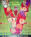
The "V" for "victory" was
very symbolic in wartime and allowed the company to communicate the desired
message effectively without including a long text. W. H. Perron (Montreal)
Catalogue, 1943-44.
|
 |
|
Commercial imagery, therefore, fulfilled various functions. First and
foremost,
it allowed consumers to identify with the models in the catalogues and
adapt
to the proposed style. As styles changed and it was important for buyers
to see
what they ordered, more and more, major department stores illustrated
their catalogues.
With time, therefore, the modest thin booklets that described an
impressive list
of products and had few illustrations, if any, became thick, full-colour
volumes.
Photography contributed to the evolution of commercial imagery. More real
than
drawings, it inevitably strengthened the relationship between the products
offered
and potential customers.
| |
 |
|
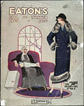
Clothing trimmed with fur
was obviously very popular with women at the time. Eaton's (Toronto)
Fall/Winter Catalogue, 1925-26, cover.
|
 |
|
| |
| |
 |
|
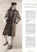
The elegance of fur-trimmed
clothing. Photography made an undeniable contribution to promotional
advertising. The models appeared more real and, therefore, more accessible.
Simpson's Catalogue, 1945, p. 4.
|
 |
|
Nevertheless, images were double-edged swords. As catalogue designers
endeavoured
to illustrate consumers' ideals, they shaped those ideals. They inevitably
transposed
their own values into images, as well as those of the companies that hired
them.
As a result, the models illustrated conformed to various standards that
were
considered acceptable by the target group, even though the catalogue
sometimes
presented contradictory social standards. This occurred as morality
evolved and
various taboos progressively disappeared, so that the values conveyed by
society
were soon reflected in the catalogues.
| |
 |
|
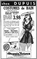
A Dupuis Frères
display ad
for bathing suits, 1939. Bathing suits were so popular that even Dupuis
Frères, a company whose values were close to the values of the
Catholic
clergy, promoted them. However, the company deemed it appropriate to
have its merchandise approved by the Catholic Women's League. La Bonne
Parole, June 1939.
|
 |
|
The fact that firms adapted to their clientele provides a good
indication
of the promotional advertising strategies employed to secure consumer
loyalty.
Having said that, the association of imagery and values transmitted brings
to
mind the expression "promotional propaganda." Since the objective was to
convince
potential customers to consume and continue to buy from the companies, the
work
of publicists and image specialists implied a highly developed art of
persuasion.
As the virtues of the companies were praised, buyers did more than just
obtain
a consumer good; they often sided with a particular company. The one that
reached
them, that spoke to them, quite simply became their frame of reference
when it
came to shopping.
| |
 |
|
Eaton's regularly used
concepts
related to the future and progress to distinguish itself from its
competition
and instill promising ideals in its clientele. Eaton's Spring/Summer
Catalogue (French edition), 1946, cover.
|
 |
|
|
Who Was Targeted?
| |
 |
|
| |
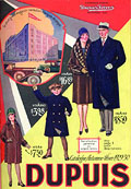
 Dupuis
Frères clearly targeted the French Canadian market by focusing on
various
family scenes. Dupuis Frères Fall/Winter Catalogue, 1929-30,
cover. Dupuis
Frères clearly targeted the French Canadian market by focusing on
various
family scenes. Dupuis Frères Fall/Winter Catalogue, 1929-30,
cover.
|
|
| |
|
|
|
Whether they targeted the well-to-do (Simpson's catalogue, for example,
featured
a lot of clothing and luxury articles) or people with more limited means
(such
as Army and Navy, which offered more modest clothing), each store had its
own
clientele, philosophy, and vision. Yet, the designers hired by large
companies
had similar mandates, since the images and subjects used were often the
same
(women, workers, new consumer goods, etc.).
| |
 |
|
| |
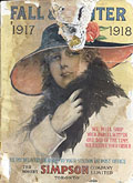
 Whether
or not it was accessible, the depiction of "chic and good taste" captured
the imagination of the consumer. Simpson's (Toronto) Fall/Winter Catalogue,
1917-18, cover. Whether
or not it was accessible, the depiction of "chic and good taste" captured
the imagination of the consumer. Simpson's (Toronto) Fall/Winter Catalogue,
1917-18, cover.
|
|
| |
|
|
|
Basically, to reach targeted consumers, they had to make them feel
involved
so that they would identify with the models illustrated in the catalogues.
Furthermore, it was not enough to depict the customers as such;
designers
had to illustrate the vision consumers had of themselves, or else the one
they
idealized. Therefore, the greater the similarity between the two images
—
the one conveyed by the catalogue and the one idealized by consumers
—
the greater the chance people would buy to move closer to their objective.
However,
consumers maintained their free will, since they obviously had the last
word.
|
| |
 |
|
| |
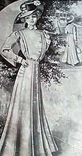
 As
a general rule, the main advertising images in catalogues featured women.
The example of the fashionable woman is clearly visible in this image.
Eaton's Spring/Summer Catalogue, 1910, p. 17. As
a general rule, the main advertising images in catalogues featured women.
The example of the fashionable woman is clearly visible in this image.
Eaton's Spring/Summer Catalogue, 1910, p. 17.
|
|
| |
|
|
|
Women at the Heart of the Purchasing Process
| |
 |
|
| |
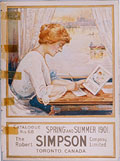
 This
type of image, which suggested that women were at the heart of the
purchasing
process, was used frequently in catalogues. Simpson's (Toronto)
Spring/Summer
Catalogue, 1901, cover. This
type of image, which suggested that women were at the heart of the
purchasing
process, was used frequently in catalogues. Simpson's (Toronto)
Spring/Summer
Catalogue, 1901, cover.
|
|
| |
|
|
|
It is obvious that the layout of the catalogue, the front cover, and
the main
images (the larger ones) focused mainly on women. Truly a target
clientele, women
were a source of inspiration for all catalogue designers, and especially
for
those who worked on the Toronto version of the Eaton's catalogue. When
they focused
on female characters, companies often depicted them making a purchase,
flipping
through a catalogue or filling out a mail-order form. Furthermore, the
image
of the woman was right at the heart of the advertising.
This privileged or strategic position can be explained by the fact that
women
were at the centre of the purchasing process; the catalogues were meant
first
and foremost for them. In addition, women were almost always depicted in
two
principal roles: participants in fashion and mothers. As fashionable
women, they
became models for the consumers who wished to follow trends. Such images
generally
emphasized a youthful attitude, beauty, grace, recreation, gardens, or
urban
streets. In its depiction of mothers, advertising was more focused on
women's
role as buyers for the whole family.
| |
 |
|
| |
 The
ideal proposed in this image from the catalogue published for the western
provinces is clearly visible, whether or not it was easy to attain.
Spring/Summer
Catalogue, 1931, cover. The
ideal proposed in this image from the catalogue published for the western
provinces is clearly visible, whether or not it was easy to attain.
Spring/Summer
Catalogue, 1931, cover.
|
|
| |
|
|
|
Images were thus ideal vehicles for imposing style and "good taste" on
female
consumers. There was an incentive to buy desirable items. Women were
invited
to criticize their appearance, so they compared themselves to the images
of beautiful
women and the ideal they represented. This type of advertising implied
that,
by purchasing the products featured in the catalogue, women would become
attractive,
desirable, and fashionable. This marketing tool, in which the consumer is
in
turn "consumed," appeared in the early 1900s and still exists today.
Since women also made purchases as mothers, the practical and useful
aspect
of various household articles had to be strongly depicted in every good
catalogue.
However, this type of advertising sometimes required models of women with
fuller
figures and heavier statures. Clearly, there had to be a good balance
between
fashion and the practical, more down-to-earth, aspects of consumer goods.
|
| |
 |
|
| |
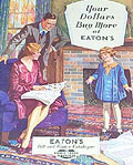
 This
tranquil image of the family inspires both confidence and happiness,
family values that were very important to Canadians at the time. Eaton's
Fall/Winter Catalogue, 1930-31. This
tranquil image of the family inspires both confidence and happiness,
family values that were very important to Canadians at the time. Eaton's
Fall/Winter Catalogue, 1930-31.
|
|
| |
|
|
|
The Model Canadian Family
Several catalogue covers highlighted family values. The images may seem
trivial,
but they contain an assortment of values associated with Canadian society
at
the time. The colours, places, people and action, and especially the role
of
the models, all provide clues to the way the "model" Canadian family was
depicted.
Consumers identified with the people in the photographs and they did not
want
to compare themselves with people who were unpleasant. Thus, family
members were
portrayed as charming and cheerful individuals. That is why the
publications
contain images of housewives who are smartly dressed, strong, and in
charge of
their households; of strong, proud, hardworking men with muscular
features; and
of children who are happy and well-behaved.
| |
 |
|
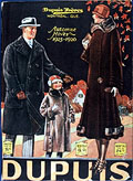
In this family scene, only
the image of the woman extends beyond the frame of the photograph. She
was obviously the person publicists were most interested in since the
catalogue was meant, first and foremost, for her. Dupuis Frères
Fall/Winter
Catalogue, 1925-26, cover.
|
 |
|
| |
| |
 |
|
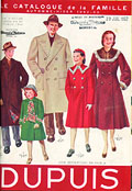
The family was extremely
important
in Quebec and often inspired Dupuis Frères designers, who portrayed
cheerful
and likeable people. The store also marketed its catalogue as the "family
catalogue." Dupuis Frères Fall/Winter Catalogue, 1952-53, cover.
|
 |
|
| |
| |
 |
|
| |
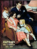
 Directly
or indirectly, the husband participated in the catalogue shopping process,
so he could not be excluded from every ad. Eaton's Fall/Winter Catalogue,
1936-37, cover. Directly
or indirectly, the husband participated in the catalogue shopping process,
so he could not be excluded from every ad. Eaton's Fall/Winter Catalogue,
1936-37, cover.
|
|
| |
|
|
|
The roles assigned to each individual are clearly identifiable. The
mother
was the radiant "queen of the castle" who looked after the household.
Dressed
almost exclusively in black or sombre colours, the husband was a strapping
man
who protected the members of his family and provided for them. Yet, he
smiled
approvingly. The retailers thus endorsed one of the widespread myths of
the time,
that women should not make purchases without the consent of their
husbands.
As for the children, they were generally between the ages of four and
twelve,
old enough to help select articles from the catalogue. The strategy is
obvious:
Children under the age of four were too young to understand how catalogue
shopping
works. As for those over the age of twelve, they were considered closer to
adults
than children. This does not mean that babies and toddlers were absent
from the
catalogues. On the contrary, every publication had a colourful section
devoted
especially to them. However, the images were intended more for the mothers
than
the children.
| |
 |
|
| |
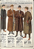
 Overcoats
for men. Class and good taste were essential for politicians and
professionals.
Eaton's Fall/Winter Catalogue, 1912-13, p. 152. Overcoats
for men. Class and good taste were essential for politicians and
professionals.
Eaton's Fall/Winter Catalogue, 1912-13, p. 152.
|
|
| |
|
|
|
Family members' daily activities also inspired catalogue designers. Not
surprisingly,
some subjects, such as the religious reality of Quebec's Catholic families
and
the assignment of duties to each member of the household, were frequently
exploited.
Males were generally portrayed as virile workers with a rather imposing
stature
(delivery men, farmers, miners, merchants, settlers, etc.), or as
professionals
and politicians.
| |
 |
|
| |
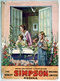
 The
young boy gets ready to do manual work, while the girl stays at home
with her mother. This clearly illustrated distribution of roles reflects
what was acceptable at the time. Simpson's (Regina) Spring/Summer
Catalogue,
1929, cover. The
young boy gets ready to do manual work, while the girl stays at home
with her mother. This clearly illustrated distribution of roles reflects
what was acceptable at the time. Simpson's (Regina) Spring/Summer
Catalogue,
1929, cover.
|
|
| |
|
|
|
Once again, the message was clear: Men worked outside the home, while
women
were confined to it. This idea was depicted in several catalogue covers;
one
shows a mother and her daughter in the house, dressed accordingly, while
the
father and the son get ready to work outdoors. Finally, it should be noted
that,
when they were not portrayed as workers, the men and women were shown
practising
a Canadian sport such as skating, cycling, or swimming.
|
|
Page 2 >>
|
|